Look, we've all sat through those presentations—you know the ones. The font's too small, there are walls of text, and you're secretly checking your phone by slide three. Here's the thing—in a world where we're constantly bombarded with design details, your slides can't just be an afterthought. They're often the difference between people remembering your brilliant ideas or forgetting them before they reach the parking lot. This article breaks down ten keys to create professional, engaging, and effective presentations that capture your audience's attention and convey your message with clarity and impact.
Ready for sleek slides? SlidesPilot combines AI-powered design elements to transform your ideas into polished, professional presentations with a built-in AI co-pilot. This intelligent tool actively enhances your slides, automatically implementing design optimizations that elevate your presentation from ordinary to extraordinary.
Before starting to create your presentation, clarify what you want to achieve with it and who will be viewing it. Understanding your audience's knowledge level, interests, and expectations will guide every design decision you make. Are you informing, persuading, or entertaining? What action do you want your audience to take afterward? A presentation for board members will look vastly different from one designed for a creative team or potential customers.
💡 Pro Tip
Create an audience persona and write down 3-5 key takeaways you want them to remember from your presentation.
2
Start With a Clear Structure
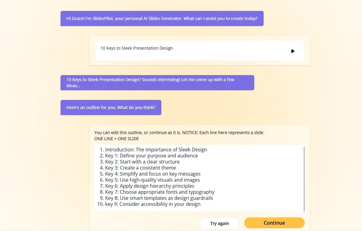
Every memorable presentation begins with thoughtful organization. Map out your presentation's journey before starting. This foundational blueprint ensures your design serves your content rather than competing with it. Organize your thoughts into distinct sections, and consider how transitions between ideas will flow. Remember that even the most beautiful slides cannot compensate for disorganized thinking.
💡 Pro Tip
Type your topic or any relevant text using SlidesPilot's AI Slides Generator and a presentation outline will be automatically generated for you.
3
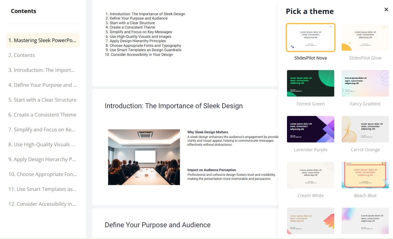
Create a Consistent Theme
Consistency is the hallmark of professional design. Choose a theme that aligns with your brand or message and stick with it throughout your slides. This includes consistent use of colors, fonts, imagery styles, and slide layouts. A cohesive visual identity helps your audience focus on your message rather than being distracted by jarring design changes.
💡 Pro Tip
Choose a theme from SlidesPilot's theme library to ensure consistency.
4
Simplify and Focus on Key Messages
The most common presentation mistake is overcrowding slides with information. Each slide should communicate a single idea or point. Apply the "less is more" principle by removing anything that doesn't directly support your key message. Use bullet points sparingly, and never include complete paragraphs on slides. Your slides should support your verbal presentation, not replace it.
💡 Pro Tip
Remember the 6 x 6 rule as a starting point: no more than six bullet points per slide and no more than six words per bullet.
5
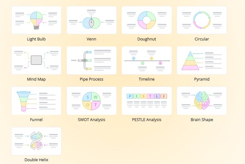
Use High-Quality Visuals and Images
Visual elements are processed 60,000 times faster than text by the human brain. High-quality, relevant images, charts, and diagrams can dramatically improve audience engagement and information retention. Avoid generic stock photos and clip art, which can make your presentation look dated or unprofessional. When using data, choose the most appropriate chart type to visualize your information clearly.
💡 Pro Tip
Choose from SlidesPilot's "New Visuals" and "AI Image Generator" for adding visuals and images to your slides.
Visual hierarchy guides your audience's attention through your slide in the order you intend. Create clear hierarchy through size (larger elements first), color (brighter, more saturated colors draw attention), contrast, positioning, and negative space. Your most important elements should stand out visually, while supporting elements should be less prominent. This organization helps viewers quickly understand what matters most on each slide.
💡 Pro Tip
Squint at your slide from a distance. The elements that remain visible are what your audience will notice first. Adjust if this doesn't match your intended focus.
7
Choose Appropriate Fonts and Typography
Typography plays a crucial role in presentation readability and professionalism. Limit yourself to two fonts--typically one for headings and one for body text. Choose sans-serif fonts (like Arial, Helvetica, or Calibri) for better on-screen readability. Ensure font sizes are large enough to read from the back of the room. Use bold, italics, and color to create emphasis, but avoid underlining and all-caps text, which reduce readability.
💡 Pro Tip
Test your presentation on the actual display equipment you'll be using when possible, as colors and fonts may appear differently than on your computer screen.
8
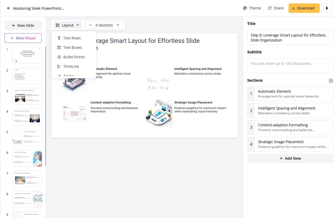
Leverage Smart Layout for Effortless Slide Organization
Smart slide layout revolutionizes presentations with its intelligent layout system that automatically arranges elements for optimal visual hierarchy and balance. It analyzes your content to distribute text, images, and graphics perfectly across slides while maintaining consistent spacing and alignment. This smart technology adapts layouts based on content volume, ensuring appropriate information density without manual adjustments, saving hours of formatting time.
💡 Pro Tip
Explore SlidesPilot's multiple Smart Layout presets to quickly visualize different arrangement options and choose the one that best communicates your specific message and narrative flow.
9
Consider Accessibility in Your Design
Design your slides with accessibility in mind to ensure your message reaches everyone. Use high-contrast color combinations for better visibility, avoid relying solely on color to convey information, and include alt text for images. Ensure readable font sizes and maintain good text-to-background contrast. These small adjustments make your presentation inclusive for those with visual impairments, color blindness, or other accessibility needs.
💡 Pro Tip
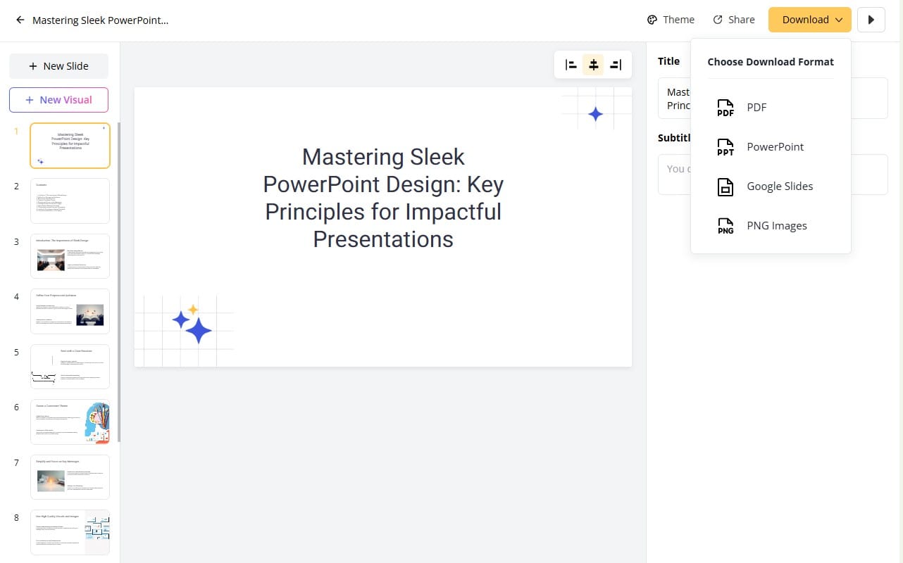
Download your presentation file from SlidesPilot directly as PowerPoint, Google Slides, PDF or PNG format.
10
Practice and Refine Your Delivery
Even the most beautifully designed presentation fails without effective delivery. Practice your presentation multiple times, ideally in conditions similar to your actual presentation environment. Time yourself, record a practice run, or present to a test audience for feedback. Check how your slides look from different positions in the room. Prepare for technical difficulties with backups and alternatives. Remember that your slides support your message—you are the presentation, not your slides.
💡 Pro Tip
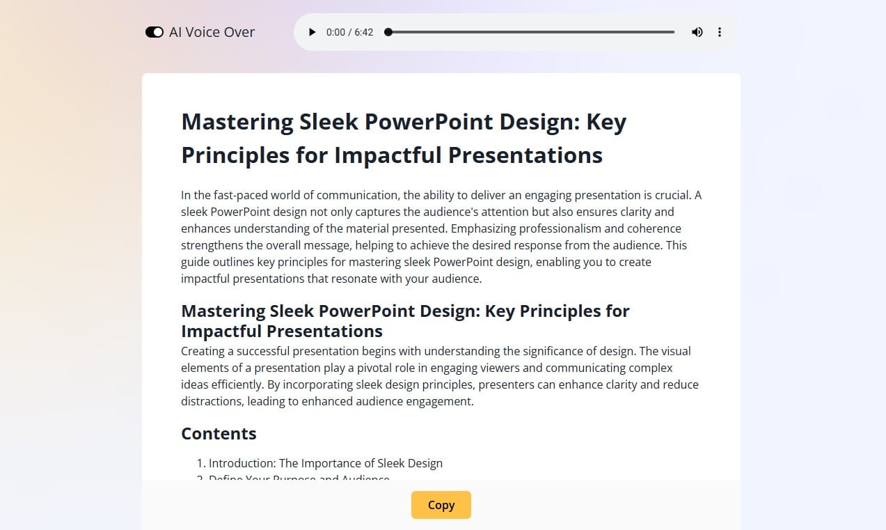
Use SlidesPilot's "Generate Voice Over AI" feature to create a polished script for your presentation.
Key Takeaway:
Creating polished presentations is both an art and a science. By adopting these ten key principles, you can design presentations that effectively communicate your message while engaging your audience visually and intellectually. Start with clear objectives, maintain consistency, embrace simplicity, and refine at the end. With the help of modern AI slides generators, like SlidesPilot, you'll streamline the whole design process and create professional-quality presentations in minutes, allowing you to focus on content while the technology handles design elements that captivate your audience.