13 Essential PowerPoint Visuals: Transform Presentations with AI-Generated Diagrams and Charts


Did you know that our brains process visuals 60,000 times faster than text? Or that we remember 80% of what we see but only 20% of what we read? These aren't just fascinating statisticss—they're the foundation of why text-heavy information consistently fails to engage audiences.
In today's world of shrinking attention spans and information overload, creating engaging PowerPoint presentations is both more challenging and crucial than ever. Visuals play a vital role in transforming ordinary slides into powerful communication tools. While text conveys information, strategic visualization makes presentations truly engaging, memorable, and effective. This article introduces 13 powerful visuals, with examples, that can elevate your presentations from ordinary to extraordinary.
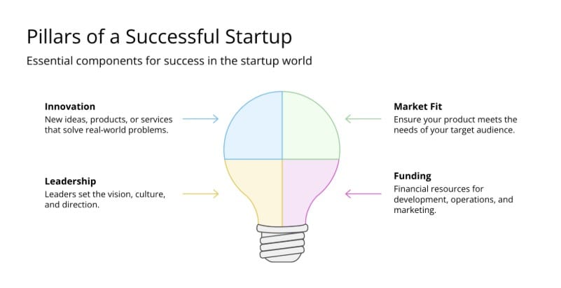
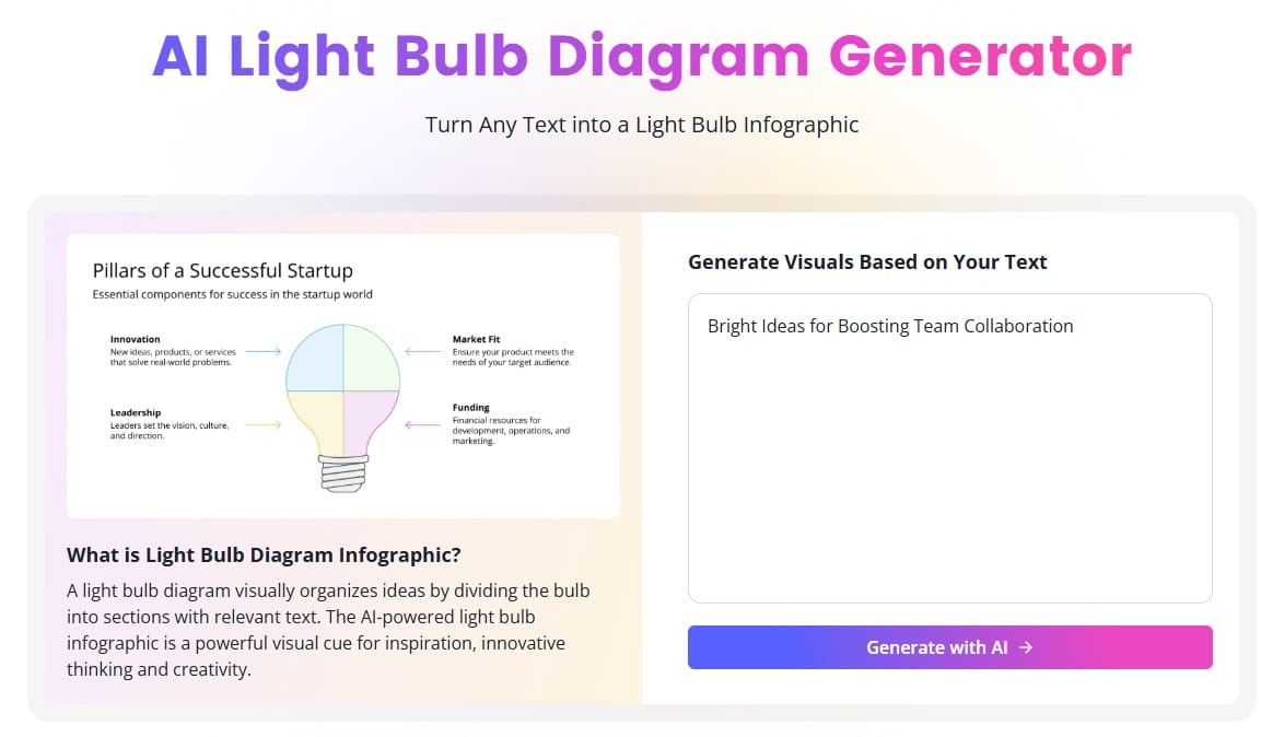
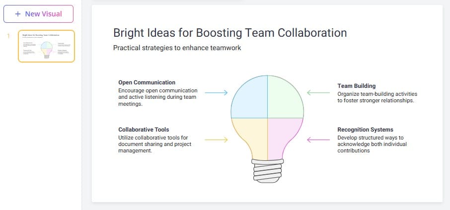
- Light Bulb Diagram
The light bulb diagram is a visual metaphor for ideas and innovation. With the bulb representing the central concept and rays extending outward for supporting elements, it's ideal for brainstorming sessions, creative problem-solving presentations, or illustrating "aha moments." This instantly recognizable format helps showcase breakthrough ideas and their components—making complex concepts resonate with audiences.
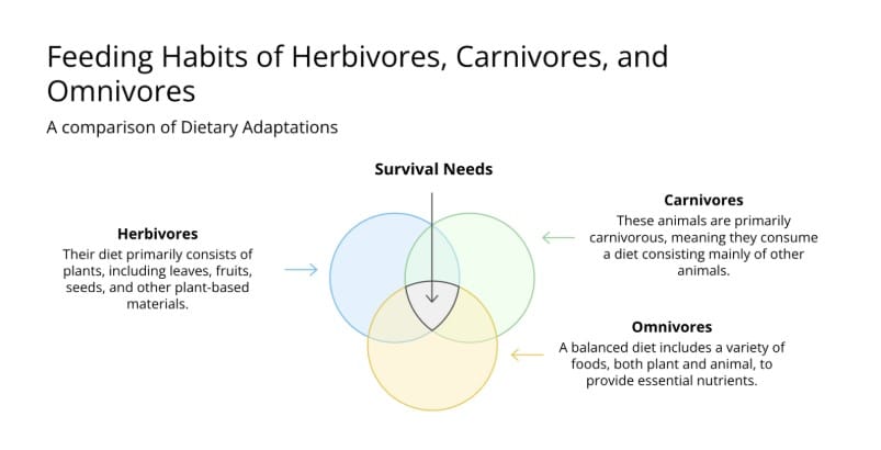
- Venn Diagram
Venn diagrams are versatile visualization tools that use overlapping circles to show relationships between sets or concepts. Where circles overlap, they reveal commonalities, while separate areas highlight unique characteristics. These diagrams excel at demonstrating similarities and differences—whether comparing products, illustrating market segments, or showing conceptual relationships. Their simple yet powerful structure helps audiences grasp complex relationships that would be difficult to express in words alone.
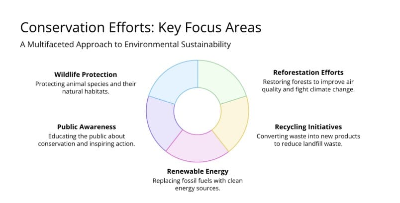
- Doughnut Chart
The doughnut chart, a circular chart with a hollow center, is a pie chart variant that enhances visual appeal while showing proportional relationships. Its center space accommodates totals, titles, or supplementary information. These charts excel at presenting survey results, budget allocations, and market share analyses. Their efficient design enables quick comparisons while using minimal presentation space.
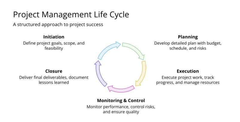
- Circular Diagram
Circular diagrams (or cycle diagrams) represent continuous processes or relationships that have no clear beginning or end. Their continuous nature makes them perfect for illustrating cycles, workflows, and recurring processes. You can use them to present customer journey maps, product life cycles, or any concept that flows in a cycle. The circular structure emphasizes the continuous nature of the process, helping audiences grasp how each stage connects to the next.
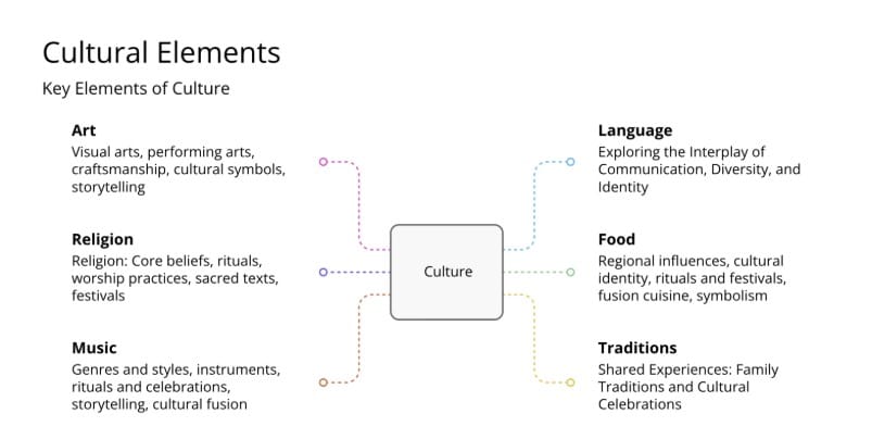
- Mind Map
Mind maps branch out from a central concept with ideas radiating in all directions—mirroring how our brains create associations. This intuitive structure excels at organizing information hierarchically while revealing connections between ideas. Mind maps prove especially effective for content outlines, project planning, note-taking, and brainstorming sessions. Their natural, flowing layout sparks creativity and helps viewers grasp complex idea relationships, making them powerful tools for both organizing and generating information.
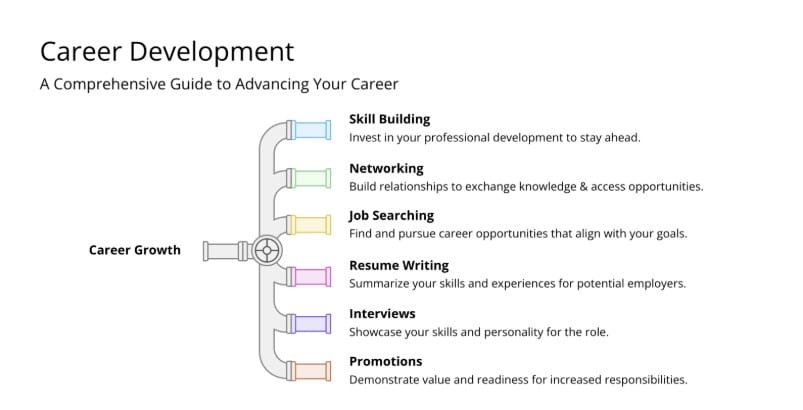
- Pipe Progress
Pipe progress, also called Pipeline diagrams, show how items flow through a system, often using narrowing sections to represent progression or filtering. These visuals effectively illustrate conversion funnels, workflow approvals, and decision-making processes. The pipe metaphor naturally shows how items, people, or information move through different stages, helping audiences understand sequential processes where volumes change over time.
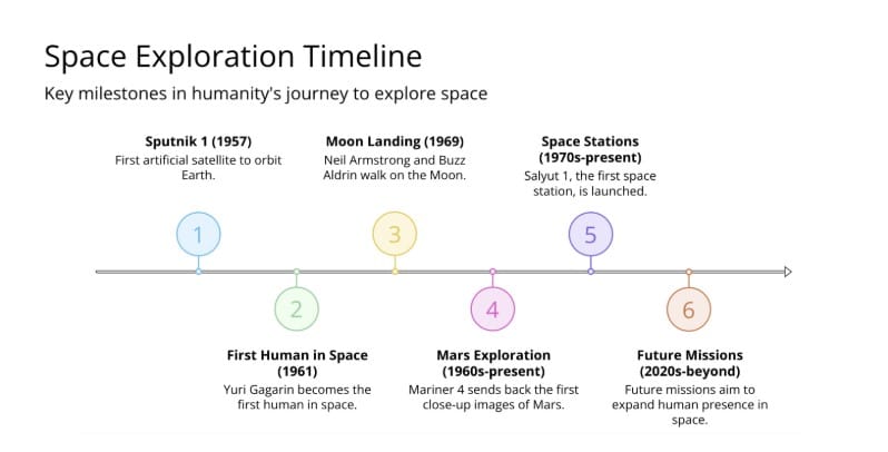
- Timeline
Timelines arrange events chronologically, making them essential for historical overviews, project schedules, and development road maps. Their linear structure creates a clear narrative flow that highlights key milestones and relationships in time. Timelines range from simple linear progressions to branching structures showing parallel developments. By placing events in historical context, they help audiences grasp the flow of evolution and cause-and-effect relationships.
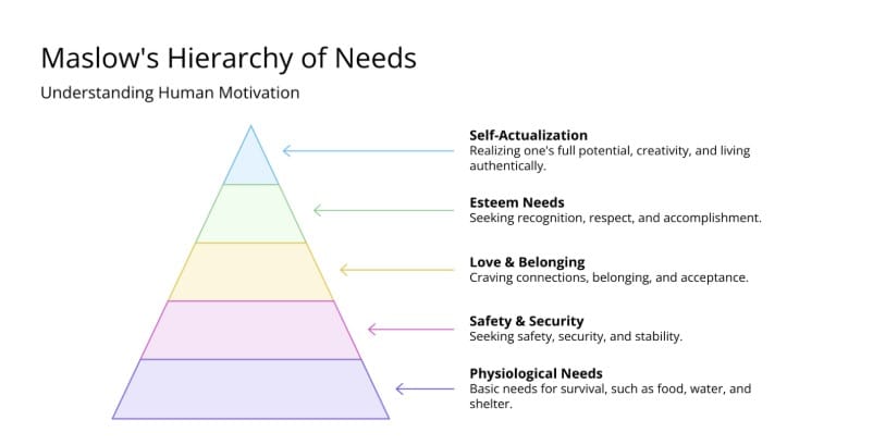
- Pyramid Chart
Pyramid charts display hierarchical information in a triangular format—with the broadest level at the base narrowing to a single point at the top. This structure naturally shows priority levels, hierarchies, and foundation-to-peak relationships. They work well for organizational structures, Maslow's hierarchy of needs, and risk assessments. The pyramid's shape conveys both stability through its wide base and achievement through its peak, making it ideal for motivational presentations.
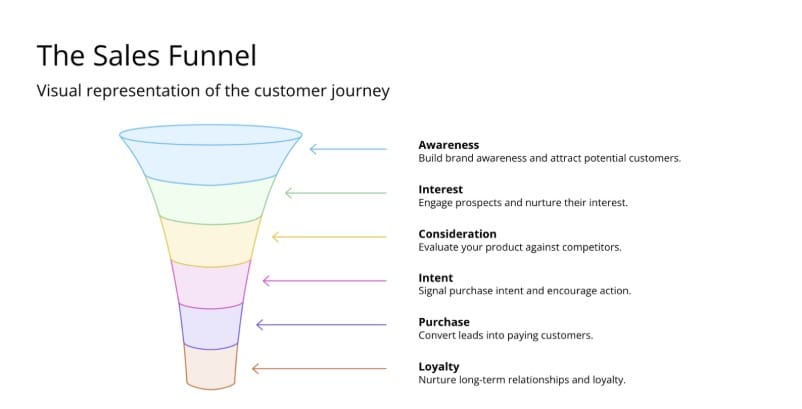
- Funnel Chart
Funnel charts display sequential processes where values decrease at each stage. Their shape naturally conveys narrowing progression, making them ideal for sales conversions, recruitment pipelines, or customer acquisition flows. Unlike pyramids, funnels emphasize conversion rates between stages, revealing drop-offs and helping presenters spot bottlenecks. The intuitive design immediately shows viewers that narrowing is a natural part of the process.
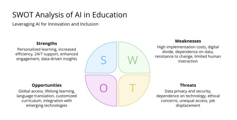
- SWOT Analysis
SWOT (Strengths, Weaknesses, Opportunities, Threats) analysis employs a four-quadrant matrix to evaluate internal and external factors affecting an organization or project. This framework balances positive and negative elements—both within and beyond your control. SWOT analyses are crucial for strategic planning presentations, helping audiences understand the full situational landscape at a glance. By organizing all relevant factors in a single visual, they enable clearer decision-making.
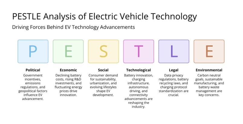
- PESTLE Analysis
PESTLE analysis examines key external factors affecting an organization: Political, Economic, Social, Technological, Legal, and Environmental. This framework helps organizations predict changes that could impact their strategy. In presentations, PESTLE offers a thorough analysis of external factors, showing careful consideration of future challenges. The systematic approach ensures all major outside influences are considered, demonstrating strategic thinking and preparedness.
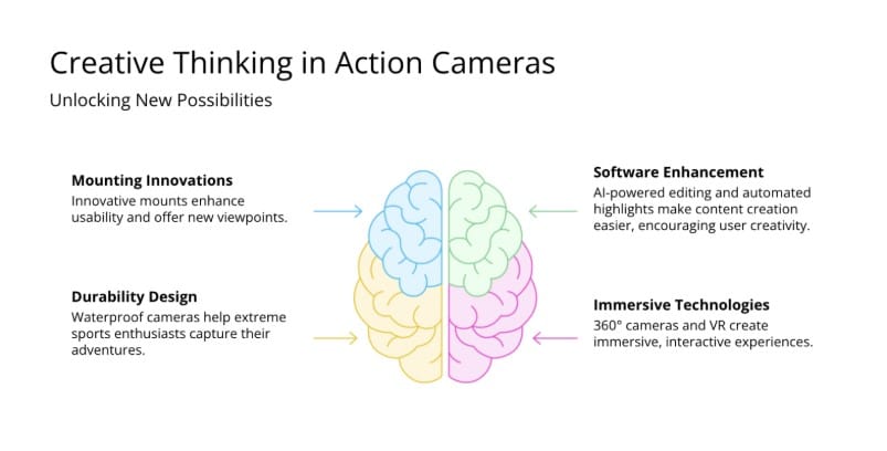
- Brain Shape Diagram
Brain shape diagrams utilize the familiar outline of the human brain to organize information about thinking, learning, and cognitive processes. The diagram is typically divided into sections that represent different mental functions or thinking styles. These visuals are especially effective for presentations about creativity, learning styles, and cognitive behavior. The brain shape creates an instant connection to intelligence and thought processes, helping viewers relate to abstract concepts through a familiar visual reference.
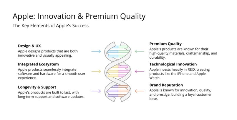
- Double Helix
Inspired by DNA's structure, double helix diagrams feature two strands spiraling around each other with connecting elements. This structure effectively illustrates complementary concepts, interrelated factors, and evolutionary processes. They excel at showing relationships between seemingly opposite ideas, interconnected timelines, or co-evolving factors. The DNA metaphor lends scientific credibility while highlighting the inseparable nature of the two strands, making it perfect for demonstrating how different elements combine to create something greater than their parts.
By incorporating these powerful visuals into your presentations, you can transform complex information into engaging, memorable content that resonates with your audience long after your presentation ends.
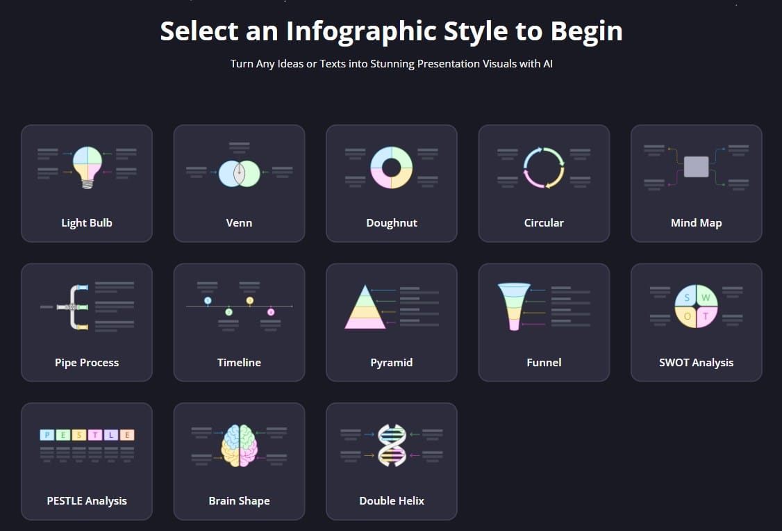
(You can get the above diagrams and charts in SlidesPilot's AI Visual Maker. A detailed step-by-step guide is listed below.)
Choosing the Right Visual
Selecting the right visual tool can transform your presentation from simply informative to truly impactful. Each visual serves a specific purpose and works best with particular types of information. Here's a summary to help you choose the right visual for your message:
| Visual | Best Used For | When to Choose | When to Avoid |
|---|---|---|---|
| Light Bulb Diagram | Innovation, creative ideas, solutions | Introducing novel concepts or "aha" moments | Presenting factual data or comparisons |
| Venn Diagram | Relationships, similarities, differences | Comparing 2-3 sets with overlapping elements | Working with more than 3-4 categories or unrelated items |
| Doughnut Chart | Proportions, parts of a whole | Showing category distribution with a central summary | Comparing precise values or many small segments |
| Circular Diagram | Cycles, recurring processes | Illustrating continuous workflows or feedback loops | Displaying linear processes or one-time events |
| Mind Map | Brainstorming, hierarchical connections | Organizing related concepts from a central idea | Presenting quantitative data or sequential steps |
| Pipe Progress | Sequential flows, filtering processes | Visualizing step-by-step progressions with narrowing | Showing non-linear relationships or complex systems |
| Timeline | Chronological events, history | Presenting sequence-dependent information | Comparing non-time-based data or cyclical processes |
| Pyramid Chart | Hierarchies, prioritization | Showing foundation-dependent concepts or importance levels | Illustrating equal relationships or cycles |
| Funnel Chart | Conversion rates, progressive reduction | Tracking diminishing numbers through defined stages | Presenting stable metrics or growth patterns |
| SWOT Analysis | Strategic positioning assessment | Balancing internal capabilities with external factors | Detailed operational planning or pure data visualization |
| PESTLE Analysis | External environmental factors | Comprehensive macro-environment evaluation | Internal process analysis or immediate tactical decisions |
| Brain Shape Diagram | Thinking processes, cognitive concepts | Topics related to learning, creativity, or psychology | Data-heavy presentations or concrete operational topics |
| Double Helix | Interdependent factors, parallel evolution | Showing intertwined processes or complementary concepts | Simple, straightforward data or unrelated elements |
Selecting the appropriate diagram depends on your specific communication goal:
- For relationships between concepts: Venn Diagrams, Mind Maps
- For hierarchical information: Pyramid Charts, Funnels
- For processes: Circular Diagrams, Pipe Progress, Timelines
- For strategic analysis: SWOT, PESTLE
- For creative concepts: Light Bulb Diagrams, Brain Shape Diagrams
- For interrelated factors: Double Helix
The most effective presentations often combine multiple visualization types, using each where its unique strengths best serve the content. Remember that these visual tools should clarify rather than complicate your message - choose simplicity and clarity over complexity and comprehensiveness when in doubt.
The AI Advantage: Creating Visuals Without the Hassle
Creating professional-quality diagrams and charts once required either specialized design skills or hours of frustrating trial and error. Now, SlidesPilot, an AI-powered presentation generator, is revolutionizing this process. With a simple text prompt, you can generate any of these 13 visual types perfectly tailored to your content. SlidesPilot automatically handles design principles like color harmony, proper spacing, and visual hierarchy—producing professional results without the technical expertise. Here is a step-by-step guide to using SlidesPilot:
Step 1: Access the AI Visual Maker.
Step 2: Choose an infographic style to get started.
Step 3: Type in your topic or any relevant text for AI generation.
Step 4: Your visual is ready! You can edit it with PowerPoint, or download it directly.
Key Takeaways:
When selecting between visual options, consider the following:
- What is the natural structure of my information? (comparative, sequential, hierarchical, etc.)
- What specific insight am I trying to highlight? (trend, relationship, proportion, etc.)
- What is my audience's familiarity with different visual formats?
- What level of detail is necessary versus distracting?
- What practical constraints affect my decision?
- Sometimes a single visual type can't capture the full picture. Consider combining different visual types.
Superfast presentation creation
Join 1 million professionals, students, and educators
Sign up for FREE →